Choosing the right color palette can feel like an art heist—exciting yet nerve-wracking. One minute you’re dreaming of vibrant reds and sunny yellows, and the next, you’re stuck in a sea of bland beiges. But fear not! With the right guidance, picking a color scheme can be as fun as a game of paintball, minus the bruises.
Popular Color Palette Ideas
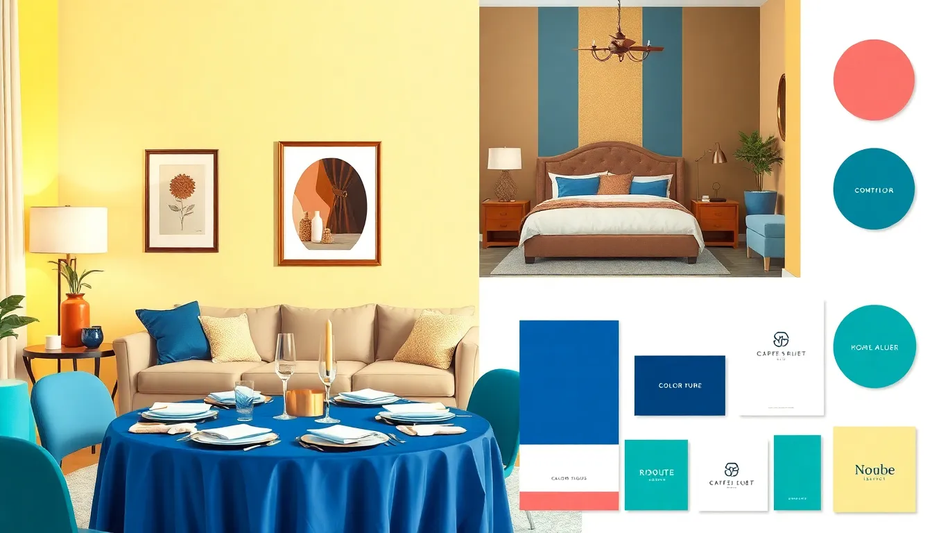
Selecting a color palette enhances the design process. Different approaches suit various projects and include monochromatic schemes, complementary colors, and analogous palettes.
Monochromatic Schemes
Monochromatic schemes use one base color in different shades, tints, and tones. This approach creates a cohesive and harmonious look. For instance, a blue palette can range from light sky blue to deep navy. Designers often favor monochromatic schemes for minimalist aesthetics, as they evoke simplicity and elegance. Using a single color helps highlight textures and shapes without distraction.
Complementary Colors
Complementary colors sit opposite each other on the color wheel. These contrasting hues generate vibrancy and energy when paired together. For example, blue and orange create a striking visual impact. This method works well for grabbing attention in marketing materials. Mixing complementary colors adds depth and excitement, allowing for dynamic designs that stand out.
Analogous Palettes
Analogous palettes involve three colors located next to each other on the color wheel. This choice ensures a serene and pleasing visual experience. For instance, a combination of green, blue, and teal creates a calming effect. Designers often opt for analogous palettes in branding to convey harmony. The smooth transitions between the colors enhance the overall design, making it visually appealing and cohesive.
Color Palette Ideas for Different Settings
Choosing the right color palette can enhance various settings, creating the desired ambiance and communicating specific messages.
Home Interiors
Home interiors benefit from thoughtful color palette selection. Warm colors like soft yellows and earthy browns create coziness in living rooms. In contrast, cooler shades such as blues and greens evoke serenity in bedrooms. For kitchens, bright whites with pops of color can stimulate energy and creativity. Using a single color in different shades promotes a unified look. This approach often appeals to those seeking minimalism while allowing for personality through accents.
Event Planning
In event planning, color palettes set the tone for guests. Vibrant hues like royal blue and gold convey celebration, ideal for weddings or birthdays. Neutral colors combined with pastels can create an elegant ambiance for formal gatherings. Playful combinations like pink and teal suit casual parties and themed events. Consistency in colors across invitations, decorations, and table settings ensures a cohesive feel. This strategy enhances the overall experience and elevates the event’s aesthetic appeal.
Branding and Marketing
Branding and marketing hinge on effective color choices. Companies often use blue to instill trust, making it popular among financial institutions. Bright colors like red and orange capture attention, suitable for food and entertainment brands. Soft pastels can evoke a sense of calm, ideal for wellness and beauty sectors. Consistent color usage across promotional materials strengthens brand identity. This connection helps consumers recognize and connect with brands more effectively over time.
Tips for Creating Your Own Color Palette
Creating a color palette involves understanding key concepts and leveraging available resources effectively.
Understanding Color Theory
Color theory forms the backbone of any successful palette. The color wheel is essential for identifying relationships among colors, including primary, secondary, and tertiary hues. Complementary colors enhance contrast, while analogous colors provide harmony. It’s crucial to recognize warm and cool colors; warm colors invite energy, while cool colors promote calmness. Experimenting with saturation can evoke different emotions; vibrant colors stimulate excitement, and muted tones encourage relaxation. By mastering these elements, designers can craft palettes that effectively convey desired messages and create engaging atmospheres.
Using Online Tools
Many online tools simplify color palette creation. Websites like Coolors and Adobe Color offer pre-made schemes and allow users to experiment with varying combinations. Users can upload images to extract colors directly from photos, facilitating inspiration from real-life scenes. Additionally, these platforms enable designers to test different shades and tints, refining choices until the perfect combination emerges. With user-friendly interfaces, navigating through options becomes enjoyable. Utilizing these resources can significantly enhance the palette development process, ensuring color decisions align with the intended project goals.
Trends in Color Palettes
Color palettes evolve continuously, reflecting shifts in design preferences and cultural influences. Earthy tones gained popularity recently, capturing a sense of nature and grounding in contemporary interiors. Pastel colors emerged, creating soft, calming environments perfect for serene spaces. Bold, saturated shades also find relevance, often sparking creativity and energy in visual designs.
Minimalism remains a prominent trend, showcasing monochromatic palettes that feature varying shades of a single color. This approach provides a clean, cohesive look favored in modern architecture and product design. Similarly, neutral color schemes, including beige, gray, and off-white, maintain their popularity due to their versatility and ability to blend seamlessly into diverse styles.
Moreover, a rising interest in biophilic design has increased the use of greens and blues that evoke natural landscapes. These hues not only appeal visually but also enhance well-being by connecting interiors with the outside world. Designers frequently utilize contrasting combinations, such as vibrant oranges paired with deep blues, to create striking focal points that demand attention.
Recent influences from social media platforms promote curated color palettes that prioritize emotional connectivity. Brands increasingly adopt adaptive color schemes that resonate with target audiences, aligning with their values and aspirations. Understanding this trend can help marketers strengthen brand identity as they apply consistent color choices across campaigns, ensuring effective audience engagement.
Finally, collaborations with artists introduce innovative color concepts influenced by different cultures, encouraging diversity in design. Embracing these trends, designers can create compelling, modern palettes that resonate emotionally while enhancing aesthetic appeal.
Selecting the right color palette can transform any design project into a captivating experience. By understanding the emotional impact of colors and leveraging effective tools, anyone can create a stunning visual narrative. The evolving trends in color palettes reflect a blend of creativity and cultural influences that resonate with audiences. Embracing these ideas not only enhances aesthetics but also strengthens brand identity. As designers continue to explore new combinations and styles, the possibilities for innovative color schemes are limitless. Whether for home interiors or branding, the right palette can make all the difference.